Sunday 20 April 2014
Question 4) Final Evaluation
Question 4) How did you use media technologies in the construction, research, planning and evaluation stages?
Question 3) Final Evaluation
Question 3) What have you learned from your audience feedback?
Template of questionnaire


Results of questionnaire
I decided instead of putting every single hand written questionnaire from my 10 students on to blogger i would condense their answers on a powerpoint shown below:
Analysis of results
Overall i had positive comments on my ancillary texts however these are what people have said I could change to make them better:
Put images on the CD's
- Quite a few people have mentioned that I should put an image on the CDs so i think its important i add this to my second draft.
Corrections/change the front cover.
- Someone has commented on the front cover so i may play around with it to see what i can do to change it and make it look more effective.
The title behind the actresses head for the magazine advertisement should go somewhere else.
- This is a tricky improvement because one person has commented saying that this is a bad thing however another student has commented saying they like the idea. I dont think i am going to take this criticsm and apply the changes to my next draft because on Lana Del reys real life magazine advertisement she has done the same thing by adding her name behind her head.
Adding props to the digipack.
- i was thinking with this idea i could maybe put the props on my CD's because i quite like the layout and the images i have already got.
Change the 'shh' shot with her finger over he mouth to more central.
- With this improvement i will zoom in just on to the singers lips. This adds a variety of cinematography between my ancillary texts making it more interesting.
Add colour to the digipacks.
- Im not sure if this improvement will make my digipack look better or worse. A few people have said to add colour while others have said they like the whole effect of the texture. Therefore i will do 2 drafts trying each one out and see which is better.
Add a bit of detail to the digipacks.
- Im not really sure what this improvement means but i think i will add a swirl to the front cover like the student said to make things more pretty and creative.
Action
After reading the results from my questionnaire i decided i would reconstruct another digipack. Taking some of the improvements in mind. This is my final digipack.

For the inside right and left I got a still image from my music video of perfumes and edited it in the same style as they others. I then decided I would put this on top of the CD as shown below:


Audience feedback on video
For my audience feedback I decided to show a few people my video and then record there voice while they point out bit they like/dislike or things they think I can change. They didn't have a lot to say throughout so i just chopped the parts that they mentioned and put it in videos below.
Becky Donald (Wyke Student)-17
James weston (Student)- 18
Template of questionnaire
 |

Results of questionnaire
I decided instead of putting every single hand written questionnaire from my 10 students on to blogger i would condense their answers on a powerpoint shown below:
Analysis of results
Overall i had positive comments on my ancillary texts however these are what people have said I could change to make them better:
Put images on the CD's
- Quite a few people have mentioned that I should put an image on the CDs so i think its important i add this to my second draft.
Corrections/change the front cover.
- Someone has commented on the front cover so i may play around with it to see what i can do to change it and make it look more effective.
The title behind the actresses head for the magazine advertisement should go somewhere else.
- This is a tricky improvement because one person has commented saying that this is a bad thing however another student has commented saying they like the idea. I dont think i am going to take this criticsm and apply the changes to my next draft because on Lana Del reys real life magazine advertisement she has done the same thing by adding her name behind her head.
Adding props to the digipack.
- i was thinking with this idea i could maybe put the props on my CD's because i quite like the layout and the images i have already got.
Change the 'shh' shot with her finger over he mouth to more central.
- With this improvement i will zoom in just on to the singers lips. This adds a variety of cinematography between my ancillary texts making it more interesting.
Add colour to the digipacks.
- Im not sure if this improvement will make my digipack look better or worse. A few people have said to add colour while others have said they like the whole effect of the texture. Therefore i will do 2 drafts trying each one out and see which is better.
Add a bit of detail to the digipacks.
- Im not really sure what this improvement means but i think i will add a swirl to the front cover like the student said to make things more pretty and creative.
Action
After reading the results from my questionnaire i decided i would reconstruct another digipack. Taking some of the improvements in mind. This is my final digipack.
For the inside right and left I got a still image from my music video of perfumes and edited it in the same style as they others. I then decided I would put this on top of the CD as shown below:
The second front cover I created used the same picture as the first just the second time it only showed half of her face. I used 2 different fonts off dafont.com and these were 'linowrite' for the title and name but i also used 'dutch and harley' to get the swirl.
I also decided to put all the same images on of the actressbut with colour because someone commented on the lana del reys original digipacks front cover being in colour but mine not so I did the same below.
After showing several people all 3 digipacks they all agreed that my second draft was the best and the colour version was not as effective so below is my final digipack:
There wasn't much to change with the magazine advertisement. Again the idea of lana del reys products being in colour so i tried by putting mine in colour:
To help keep continuity between my digipack and magazine advertisement they would have to have the same effect. Therefore my magazine advertisement would have to be in the vintage brown effect like the digipack. Especially when people said they preferred the brown effect of the digipack over the colour version. I also think the brown effect if more effective.
For my audience feedback I decided to show a few people my video and then record there voice while they point out bit they like/dislike or things they think I can change. They didn't have a lot to say throughout so i just chopped the parts that they mentioned and put it in videos below.
Becky Donald (Wyke Student)-17
James weston (Student)- 18
Dom (student)- 16
Below is my new and final video with the improvements from my target audience addedMonday 10 March 2014
Final draft
Using the several forms of feedback from my original video I changed several things and added new shots to create my final draft. Detail on my feedback will all be displayed and explained in my evaluation.
Tuesday 4 March 2014
First Draft- Music video
Unfortunately when I was converting my movie to a video file some of my footage had been lost. For the shots that are misisng i put credits in place of it. These scenes will be refilmed next week.

This is due to me deleting some of the videoing of the memory card that I hadn't imported properly onto the mac.
Below is my first draft of the video:
This is due to me deleting some of the videoing of the memory card that I hadn't imported properly onto the mac.
Below is my first draft of the video:
http://www.youtube.com/watch?v=j4vdJTJm6KU
Friday 14 February 2014


Thursday 13 February 2014

Digipak- Inside left and right for CD

Digipack- Front Cover
For my 2 front covers i just used one of the images i had already edited. For the first cover I did the font the same way as i did the back cover by using 'dafont.com' and used the same font 'apple Garamond' for the artists name and album name however i made the album name bolder to make it stand out.

Digipack- The back
When creating the back i had to research some songs that i would put on that were already made my lana del rey. These are what i have found..
1. Carmen
2. Summertime Sadness
3. Dark paradise
4. National Anthem
5. Video Games
6. Blue Jeans
7. Ride
8. Young and beautiful
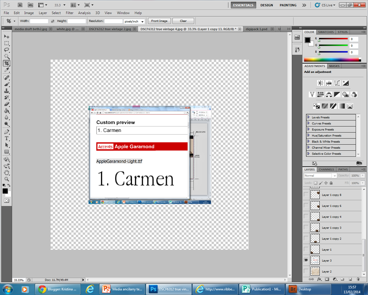
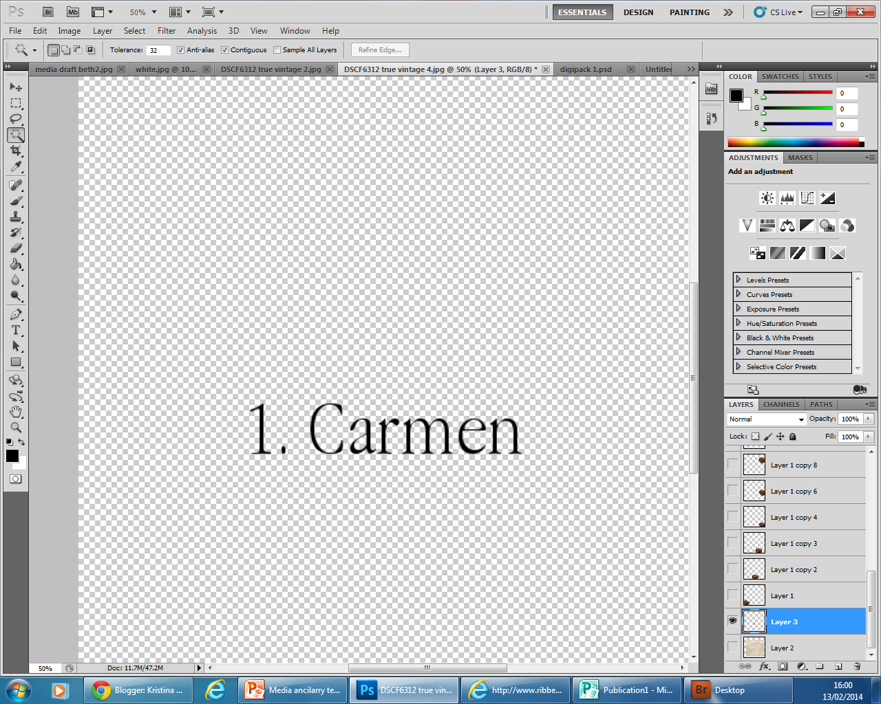
To find the font for the back cover i used 'dafont.com'. I chose to go with the style 'apple garamond'. I print screened the image of the website:


I then did this for all the rest of the songs.

 Executive producers: Dr James & Luke David
Original Painting by Rodeo Clive
Direct management group, inc/ Mathew Grove, Davis Stent
2010,2013 capitol records. Manufactured by capital records
100 Ninth Avenue, California, CN 10011. All rights reserved, unauthorized reproductions and violation of applicable laws.
Final Back cover of CD

1. Carmen
2. Summertime Sadness
3. Dark paradise
4. National Anthem
5. Video Games
6. Blue Jeans
7. Ride
8. Young and beautiful
To find the font for the back cover i used 'dafont.com'. I chose to go with the style 'apple garamond'. I print screened the image of the website:
I then went on to photoshop and pasted it onto it there. Where i would then use the rubber to rub around the text. I then used the magic want tool to get rid of the rest of the white.
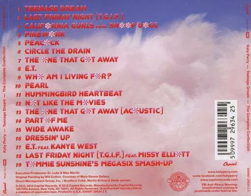
Here is the back of a katy perry CD. It shows other conventions i must include these are:
- The name of the album on the side
- Bar code
- Producer
- Copyright when it was made
- Managements groups
- Executive producers.
To make this on my own i thought it would be quite hard so i just copied the text on this album cover and changed a few words.
Original Painting by Rodeo Clive
Direct management group, inc/ Mathew Grove, Davis Stent
2010,2013 capitol records. Manufactured by capital records
100 Ninth Avenue, California, CN 10011. All rights reserved, unauthorized reproductions and violation of applicable laws.
Final Back cover of CD
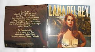
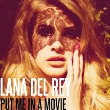
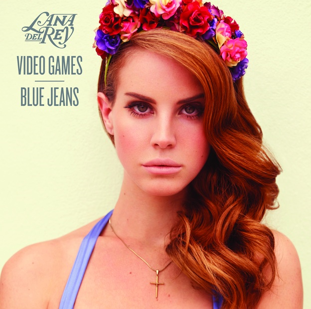
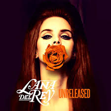
My singers previous digipacks
The best way for me to follow the conventions is by looking at lana del reys already made digipacks. These are shown below.
![]()
![]()


Editing photos for my digipack
I used pic monkey mainly for my editing. I find it a lot easier then Photoshop and I like the effect that it helped me create on the front cover. Below is a powerpoint explaining each step in editing for the photos. I also edited each photo in several different ways.
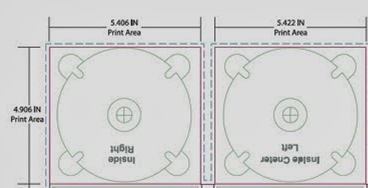
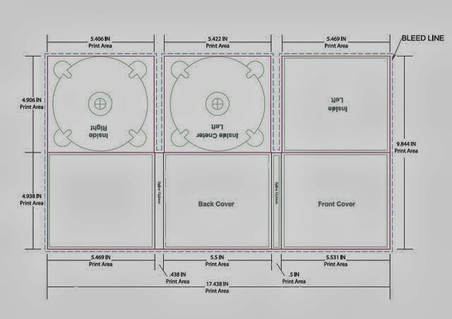
Ancillary Text- Digipack Template
When creating my digipack i am going to follow this template that our teacher gave us..
Wednesday 12 February 2014
Ancilary Texts- CD
A cover for it's release of part of a digipak (CD/DVD package):
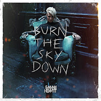
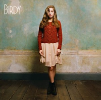
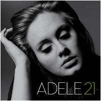
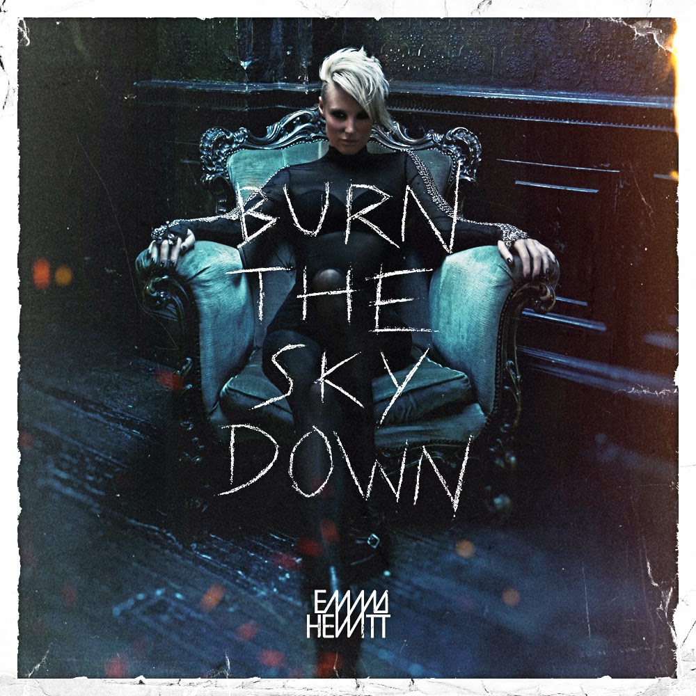
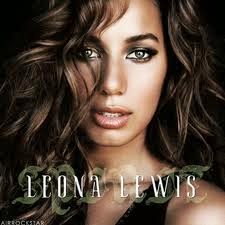
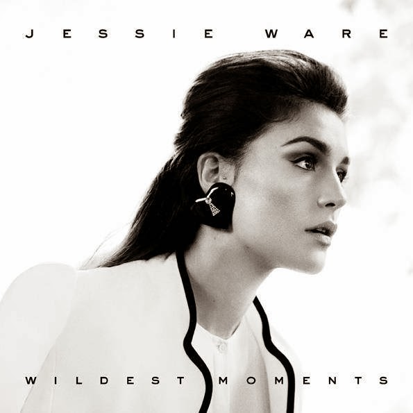
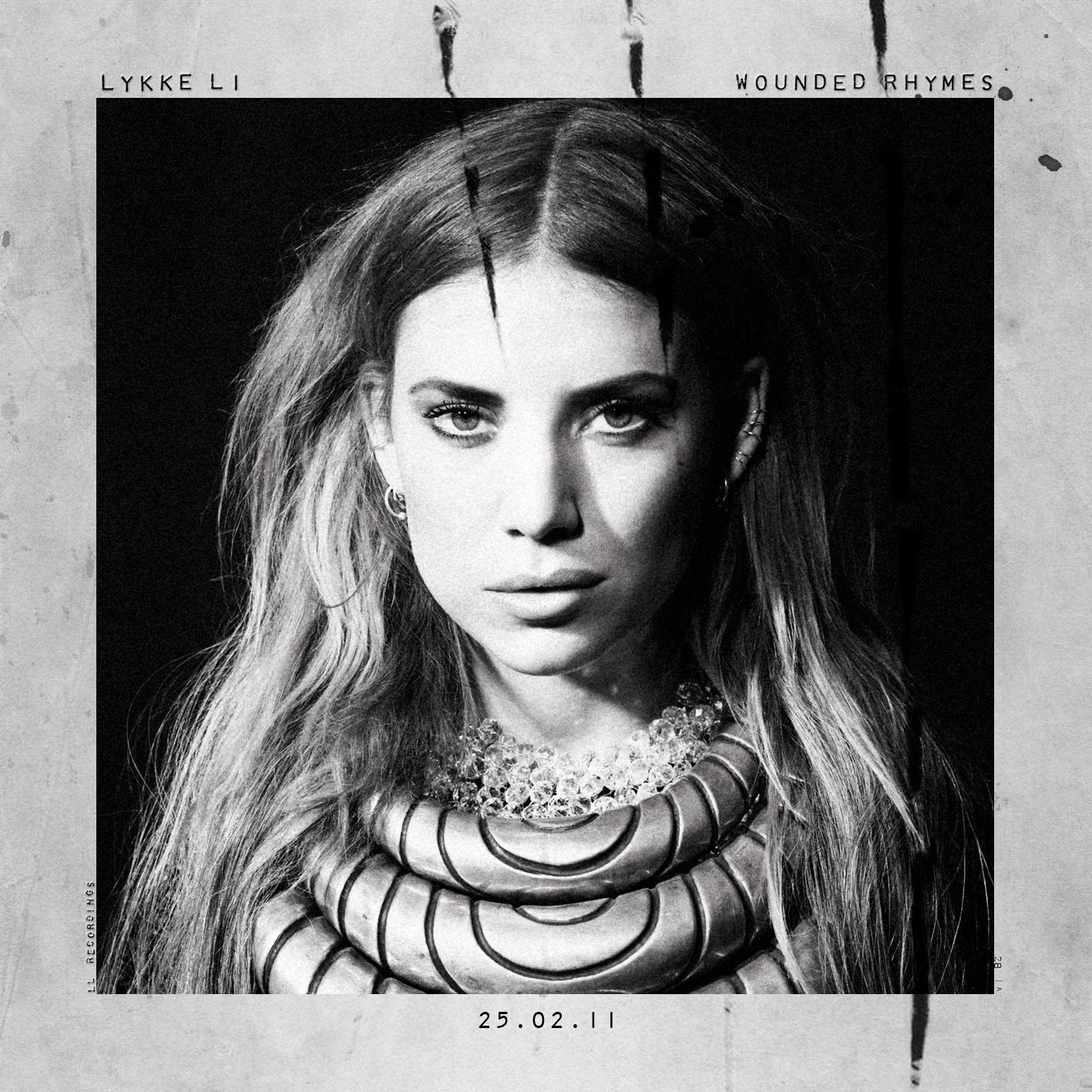
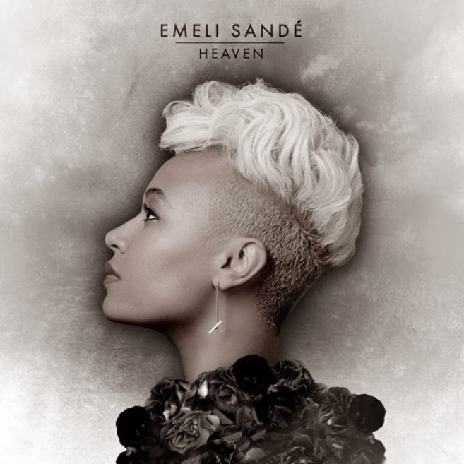
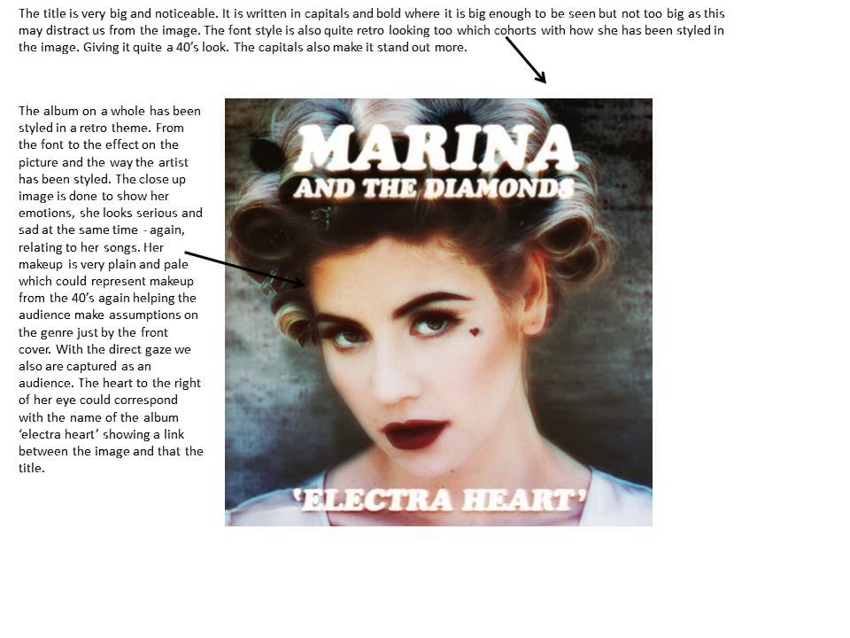
Below are some images of CD covers. These female singers are also quite closely associated to the genre of 'Lana del rey'. Every album cover is similar in each way. They are all very simple with not a lot going on within the image. The singer and the album cover is very plain and simple. It doesn't bring much attention away from the singer. At least half of the CD cover were in black and white. The reason for this was to connote nostalgia. The audience would immediately be able to see what type of genre the singer associates herself with. We also assume that the songs on the CD will symbolise sadness and depression. Most of them tend to be close ups. The reason for this is so we can see the emotion they are giving off through their album again creating assumptions for the audience. A lot of songs will be sad which is a strong emotion emphasised across their faces on the covers. Some of them also shy away from the camera emphasising this. Every single digipack cover also has a title in capital letters, this could be because it makes it stand out more.


Subscribe to:
Posts (Atom)