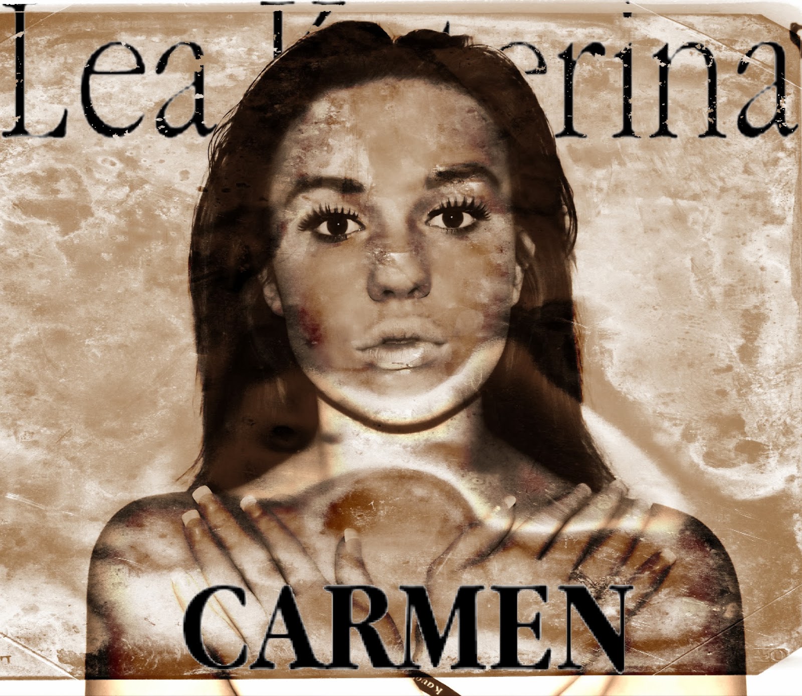
I chose to go with this plain style because i didnt want to make the CD cover look too clustered and stuffy. Also the music video itself is actually the actress with 2 lifes so its representing her life a bit like a movie.
Thursday, 13 February 2014
Digipack- Front Cover
For my 2 front covers i just used one of the images i had already edited. For the first cover I did the font the same way as i did the back cover by using 'dafont.com' and used the same font 'apple Garamond' for the artists name and album name however i made the album name bolder to make it stand out.
Digipack- The back
When creating the back i had to research some songs that i would put on that were already made my lana del rey. These are what i have found..
1. Carmen
2. Summertime Sadness
3. Dark paradise
4. National Anthem
5. Video Games
6. Blue Jeans
7. Ride
8. Young and beautiful
To find the font for the back cover i used 'dafont.com'. I chose to go with the style 'apple garamond'. I print screened the image of the website:
I then did this for all the rest of the songs.
Original Painting by Rodeo Clive
Direct management group, inc/ Mathew Grove, Davis Stent
2010,2013 capitol records. Manufactured by capital records
100 Ninth Avenue, California, CN 10011. All rights reserved, unauthorized reproductions and violation of applicable laws.
Final Back cover of CD
1. Carmen
2. Summertime Sadness
3. Dark paradise
4. National Anthem
5. Video Games
6. Blue Jeans
7. Ride
8. Young and beautiful
To find the font for the back cover i used 'dafont.com'. I chose to go with the style 'apple garamond'. I print screened the image of the website:
I then went on to photoshop and pasted it onto it there. Where i would then use the rubber to rub around the text. I then used the magic want tool to get rid of the rest of the white.
Here is the back of a katy perry CD. It shows other conventions i must include these are:
- The name of the album on the side
- Bar code
- Producer
- Copyright when it was made
- Managements groups
- Executive producers.
To make this on my own i thought it would be quite hard so i just copied the text on this album cover and changed a few words.Executive producers: Dr James & Luke David
Original Painting by Rodeo Clive
Direct management group, inc/ Mathew Grove, Davis Stent
2010,2013 capitol records. Manufactured by capital records
100 Ninth Avenue, California, CN 10011. All rights reserved, unauthorized reproductions and violation of applicable laws.
Final Back cover of CD
My singers previous digipacks
The best way for me to follow the conventions is by looking at lana del reys already made digipacks. These are shown below.
Editing photos for my digipack
I used pic monkey mainly for my editing. I find it a lot easier then Photoshop and I like the effect that it helped me create on the front cover. Below is a powerpoint explaining each step in editing for the photos. I also edited each photo in several different ways.
Wednesday, 12 February 2014
Ancilary Texts- CD
A cover for it's release of part of a digipak (CD/DVD package):
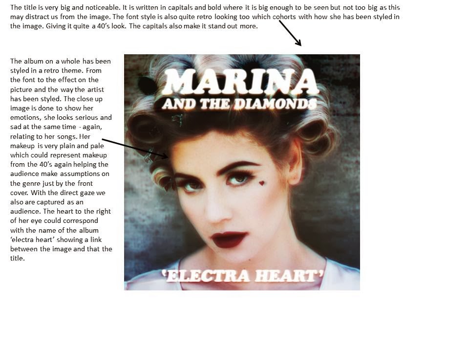
Below are some images of CD covers. These female singers are also quite closely associated to the genre of 'Lana del rey'. Every album cover is similar in each way. They are all very simple with not a lot going on within the image. The singer and the album cover is very plain and simple. It doesn't bring much attention away from the singer. At least half of the CD cover were in black and white. The reason for this was to connote nostalgia. The audience would immediately be able to see what type of genre the singer associates herself with. We also assume that the songs on the CD will symbolise sadness and depression. Most of them tend to be close ups. The reason for this is so we can see the emotion they are giving off through their album again creating assumptions for the audience. A lot of songs will be sad which is a strong emotion emphasised across their faces on the covers. Some of them also shy away from the camera emphasising this. Every single digipack cover also has a title in capital letters, this could be because it makes it stand out more.


Subscribe to:
Posts (Atom)